You’re spending the money. You’re running the ads, tweaking the creative, and watching the sessions climb in your dashboard. On paper, it looks like you’re winning. Then your bank account clears its throat and says, not really.
That gap hurts because the traffic is not junk. These are the visitors you wanted. They clicked with intent. They arrived curious. Then somewhere between interest and action, they vanished.
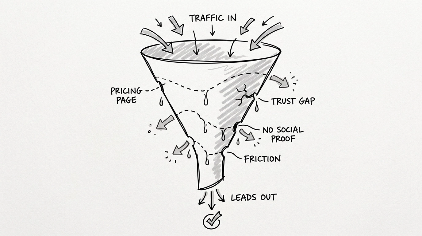
It feels like pouring water into a bucket with too many holes in the bottom. No matter how much high quality traffic you pour in, it slips away before it reaches the part where revenue happens.
This is the reality for a lot of founders and marketers right now. We got very good at getting people to the door. We are still weirdly bad at helping them feel safe enough to walk inside. If profits are dipping while traffic stays steady, you probably do not have a traffic problem. You have a conversion leak.
The Invisible Holes in Your Bucket
Most people think a bounce means the visitor was never serious. Usually, that is the comforting story we tell ourselves. It is also often the wrong one.
A lot of visitors bounce because they were interested enough to keep scanning, then hit one tiny moment of friction that snapped the spell. No reviews. Murky pricing. Too many choices. Not enough reassurance. Suddenly their brain goes from maybe yes to absolutely not today.
Think about what happens in real life. A visitor lands on your site. They like the product. They keep scrolling. Then their brain starts doing what brains do best, searching for risk. Is this legit. Will this work for me. Why is pricing making me squint. Has anyone else actually bought this.
VWO has repeatedly shown that clarity and speed matter a lot. Even small delays can hurt conversion rates. But the bigger leak is often psychological. People do not leave only because the page is slow. They leave because the page makes the decision feel heavy.
The Pricing Toggle Dance
One of the most common and most ignored leaks in the conversion funnel lives on the pricing page.
You know the move. The visitor sees a toggle for Monthly and Annual. They click Monthly. Then Annual. Then back to Monthly. Then they hover for a second like the answer might descend from the ceiling.
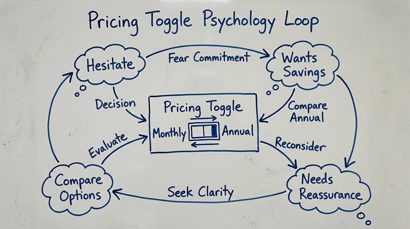
This section is not small. It is the moment where choice psychology takes over.
At first glance, the visitor looks like they are comparing prices. What they are actually doing is negotiating with their future self. Monthly feels safer because commitment is low. Annual feels smarter because the savings are obvious. So now the brain has two competing stories. Protect cash now, or maximize value later.
That tension creates friction fast. Behavioral research around choice overload and loss aversion helps explain why. People do not evaluate pricing in a neat spreadsheet way. They feel the risk first. Annual can feel like a bigger potential loss if the product disappoints. Monthly can feel like a waste if the annual savings are too visible to ignore. Either way, the visitor feels like they might make the wrong move.
So they toggle.
And toggle again.
This is the psychology of choice in action. Too little reassurance, and the choice feels expensive. Too much information, and the choice feels exhausting. The toggle becomes a loop because the page is asking for commitment before it has fully earned confidence.
This is exactly where smart conversion design matters. If someone keeps bouncing between Monthly and Annual, they are not asking for more math. They are asking for emotional proof. Show a testimonial from a customer who stayed and got results. Show a quick demo that makes the setup feel easy. Show a short note that explains who should pick Monthly and who should pick Annual. Good pricing pages do not just present options. They reduce the fear of choosing wrong.
That is why the toggle section deserves more love than most teams give it. It is not just a pricing control. It is a hesitation detector hiding in plain sight.
Why Static Tools Are Failing You
The old fix was to stack a bunch of separate apps on top of the problem. A social proof app. A countdown timer. A video widget. A lead capture tool. A heatmap tool. A mild headache.
The issue is not just clutter. These tools are static. They show the same message to everyone, whether the visitor is brand new or halfway through the Monthly versus Annual loop and one reassurance away from converting.
Then there is the performance hit. Every extra script asks your site to do more work. And slow pages are famous for killing momentum. So now you are trying to fix the leaks by tossing more tools into the bucket. The bucket is not thrilled.
Enter AI Visitor Intelligence
This is where things get interesting. Instead of guessing why people leave, imagine if your site could actually respond to what visitors are doing in real time.
At CACOptimizer, we built the widget for exactly that. It is not just a social proof tool. It is a visitor intelligence system.
When the system sees the Monthly versus Annual loop, it does not just sit there like a decorative lamp. It reads the hesitation for what it is. The visitor needs reassurance, not another generic popup.
So the widget can surface the right nudge in the moment. A testimonial from a long term customer. A quick demo video. A trust signal that reduces uncertainty before the tab gets closed and your paid click disappears into the void.
That is the real shift. Instead of treating every visitor the same, the site reacts to behavior. It is the difference between a salesperson reading from a script and a sharp consultant who notices the exact second you look unsure.
One Line of Code To Stop The Bleeding
The best part is that fixing this does not need a developer, a rebuild, or a week of Slack messages that end with circling back.
We have consolidated trust building, engagement, urgency, lead capture, and analytics into one lightweight script. It works with Shopify, WordPress, Webflow, and pretty much any stack you are already using.
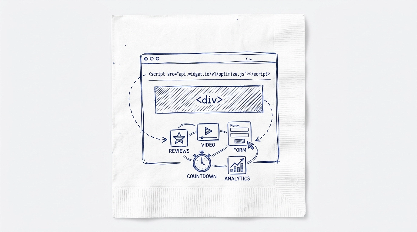
Instead of managing a pile of apps that slow down your site and barely speak to each other, you get one intelligent widget that starts building trust the moment someone lands.
If a visitor looks skeptical, show reviews. If they stall on pricing, show the proof that helps them choose. If they linger near checkout, add urgency without making the page feel like a casino. The AI handles the timing so your funnel feels helpful, not needy.
Stop Guessing and Start Converting
If you are tired of watching high quality traffic vanish, stop treating bounce rate like a mystery and start treating it like a signal.
Your visitors are showing you where the friction lives. The pricing toggle loop is one of the loudest signals on the page. It tells you the person is interested, but not fully comfortable yet. That is not a dead end. That is an opportunity.
Stop the bleeding. Fix the leaks. Turn those expensive clicks into customers who actually make it through the funnel.
You can get live in under five minutes. No more guesswork. Just a smarter funnel that keeps more of the traffic you already paid for.
Check out how we do it at CACOptimizer.com and get those conversion rates moving in the right direction again.


